Disparities
By Daniel Montanera, Ph.D., Associate Professor, Department of Economics, Seidman College of Business, Grand Valley State University
What Data Is Being Used
To investigate for disparities in health outcomes across regions and groups, we use member data provided by the private health insurance plans Priority Health (PH), Blue Cross Blue Shield of Michigan (BCBSM), and Blue Care Network (BCN) at the ZIP-code level. For each ZIP code, the data set records the number of member months in the presence of six different diagnoses: asthma, coronary artery disease (CAD), depression, diabetes, hyperlipidemia, and low back pain. We also examine the number of member months where the member is between the ages of 30 and 39, has none of these diagnoses, and has total annual expenditures below $450,000. These are labeled “healthy” member months. In addition to member months, the data also records the average risk score of the members in each ZIP-code diagnosis group. We use this as a measure of the underlying health characteristics of the member population. Finally, we have the total number of member months insured by the three private health insurance plans for the residents of each ZIP code. This allows us to construct weighted averages and measures of prevalence based on the total insured populations.
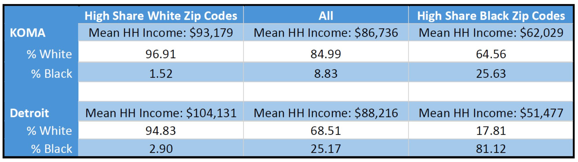
In order to categorize ZIP codes on the basis of characteristics potentially subject to health disparities, we combine the insurance plan data with 2020 census data on population, mean household income, and race at the ZIP-code level. Mean household income comes from the 2020 American Community Survey, while race and population data come from the 2020 Census Demographic and Housing Characteristics File. We then stratify the ZIP codes into population quintiles, first by income and then by race. The set of ZIP codes containing 20 percent of a given regional population with the highest weighted average income are denoted “High Income” ZIP codes, while the set with the lowest weighted average income are labeled “Low Income” ZIP codes. Similarly, the set of ZIP codes containing 20 percent of a given regional population with the highest weighted average percentage of white residents are labeled “High Share White” ZIP codes, while those with the highest weighted average percentage of black residents are labeled “High Share Black” ZIP codes. This is done separately for the KOMA and Detroit regions, and then descriptive statistics are reported for the entire region, as well as stratified quintiles. Differences in mean outcomes across quintiles are considered health disparities and any patterns with respect to income or race are investigated.
There are limitations with this approach. First, as a simple comparison of descriptive statistics, the analysis does not control all factors that are correlated with income or race. These include education, drug use, discrimination, opportunity, and family characteristics (Iguchi et al.2005). Therefore, readers should be cautious in interpreting any patterns or correlations as causal relationships. Second, the insurer data only covers the privately insured population and access for the non-privately insured to public health insurance programs is different across income and race quintiles. Therefore, even controlling for race and income, the privately insured population is bound to be different from the publicly insured and uninsured populations. This means that any inferred correlations between health disparities and income or race rely on assumptions about correlations between the member and general populations of a ZIP code.
Disparities By Income
In Table 1, we see that KOMA has a slightly lower mean household income than Detroit, but it also has a tighter income distribution. We also see the weighted Black and white shares of the populations of these sets of ZIP codes. As has already been noted in the literature, this presents difficulties in disentangling the impacts of socioeconomic status and race (Jamil et al. 2008, Meliker et al. 2009). This introduces an important caveat in the regional comparison that will be reflected again when we stratify by race: while the top income quintiles for KOMA and Detroit are not strikingly different from each other, the bottom income quintiles look very different in terms of racial distribution. So, while we will be comparing across regions those ZIP codes comprising the 20 percent of the populations with the highest weighted Black share of the population in later tables, we cannot say those quintiles have similar racial distributions.
Table 1
Average Risk Score
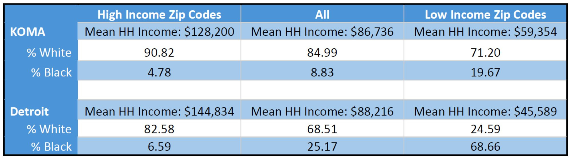
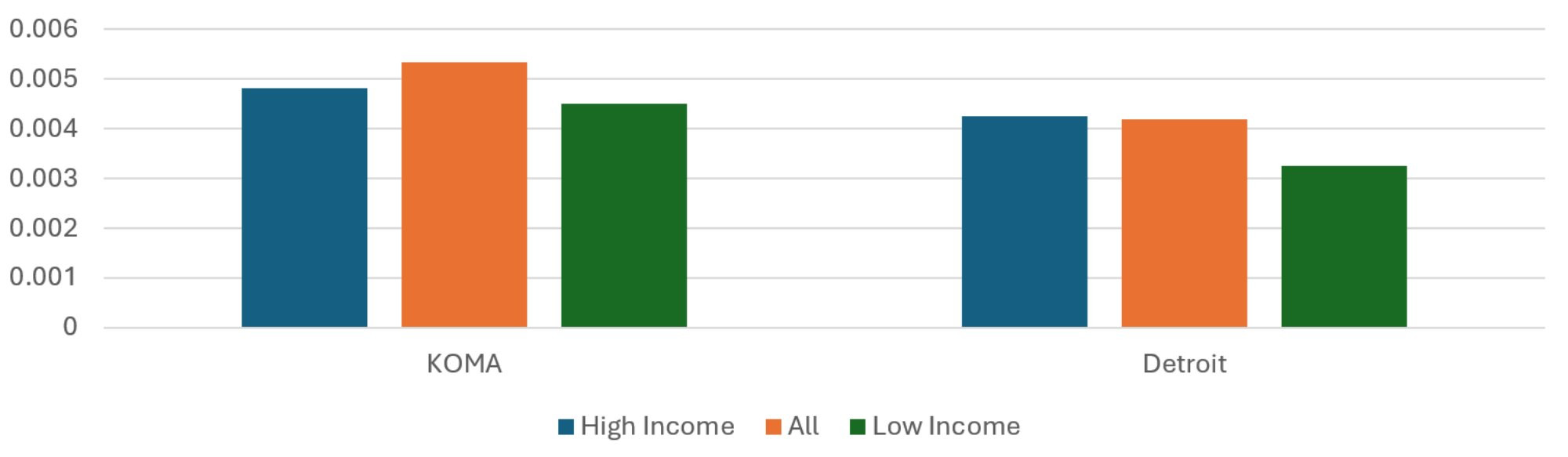
A high average risk score indicates the presence of member characteristics that are correlated with high health care spending. These risk scores are estimated by a third-party vendor, and so the exact characteristics that affect risk scores and the scoring method are not known. As is apparent from Figure 1, both regions show a trend of increasing average risk scores from the High Income ZIP codes to the Low Income ZIP codes, which is consistent with correlations between socioeconomic status and health-related variables found in the literature. The average risk score of the Low Income ZIP codes of KOMA is 15 percent greater than that of the High Income Zip codes, while that for Detroit is 21 percent. This is despite the underlying disparity in income being lower in KOMA than Detroit. The difference in the percentage gaps is lower than it was last year, suggesting some improvement in the disparities in health characteristics by income in West Michigan while those in Detroit have remained relatively stable.
Figure 1: Average Risk Score, 2024
Description: The Average Risk Score, 2024 graph shows the average risk scores for the KOMA and Detroit regions when their populations are stratified by mean household income. The regional averages are presented (middle, red) as well as the average from the residents of High Income (left, blue) and Low Income (right, green) ZIP codes. The two regions exhibit similar profiles, with relatively more negative health risk factors and characteristics (high risk scores) in the Low Income ZIP codes.
Source: BCBSM, BCN, and Priority Health member data (2025).
Average Insured Months Per Resident
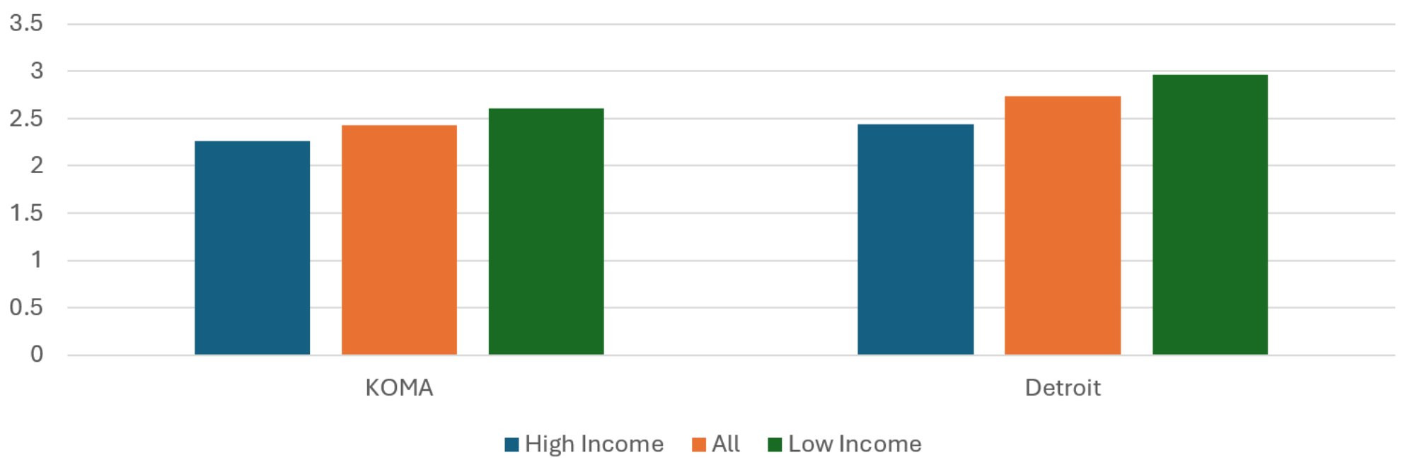
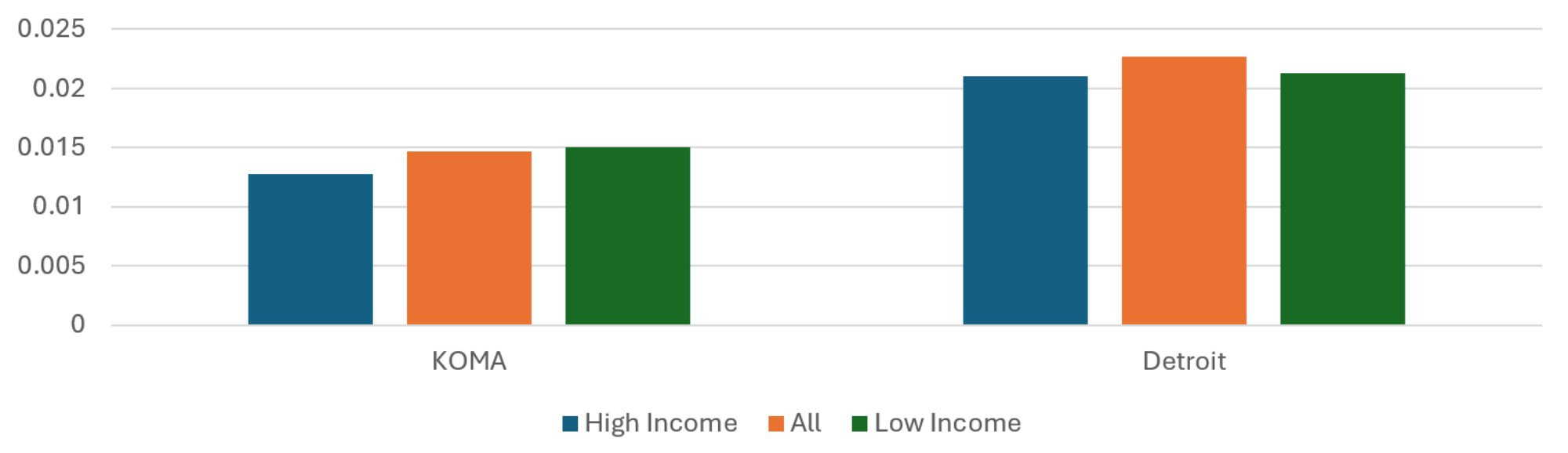
Figure 2 reports the population-weighted average number of member months in each ZIP code set, relative to the total population of the ZIP code set. This can serve as a rough measure of private insurance rates, although it is likely to be biased upward in areas where residents have multiple comorbidities. This is because an individual insured for a month while diagnosed with two different chronic conditions appears in the data as two member months.
The KOMA region had seven percent fewer insured months per resident than Detroit in 2024. It had 8.5 percent more insured member months per resident in 2023. The average insured months per resident of the Low Income ZIP codes of KOMA is 40 percent less than that of the High Income ZIP codes. This figure is 67 percent for Detroit, and both figures are very small decreases from last year. Even though a higher Detroit figure is not unexpected given that the underlying income disparity in Detroit is greater, it is not enough of a difference to explain away the income disparity in average insured months per resident. While the percentage gap in income between high and low income quintiles is 28 percent greater in Detroit than KOMA, the percentage gap in average insured months per resident is 69 percent greater. Therefore, even controlling for the difference in income disparity, the disparity in average insured months per capita across income groups is greater in Detroit than KOMA.
The increasing relationship between income quintiles and member months per capita in both regions is not surprising. This is because low-income individuals are more likely to qualify for public health insurance programs and therefore not be privately insured. This pattern of differential member months per capita across income quintiles raises the likelihood that members from low-income ZIP codes are less representative of the ZIP code population. Given the correlation between private health insurance, employment, and other socioeconomic characteristics, the disparities between members across income quintiles may underrepresent the disparities between residents.
Figure 2: Average Insured Months per Resident, 2024
Description: The Average Insured Months per Resident, 2024 graph shows the total insured member months divided by population for the KOMA and Detroit regions when their populations are stratified by mean household income. The regional averages are presented (middle, red) as well as the average from the residents of High Income (left, blue) and Low Income (right, green) ZIP codes. The two regions exhibit similar profiles, with relatively more insured months per resident of the High Income ZIP codes, but the difference between High and Low Income ZIP codes is greater in Detroit than in KOMA.
Source: BCBSM, BCN, and Priority Health member data (2025).
Average Healthy Months to Total Months
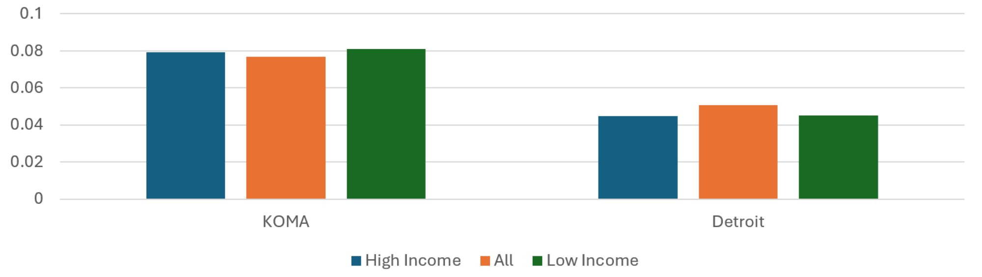
Figure 3 presents the ratios of healthy months to total member months. While previous reports showed a slight positive relationship between income quintile and healthy month ratio in KOMA, the updated methods now reveal a pronounced negative relationship. Also new is the percentage gap in healthy month ratio is greater in KOMA than it is in Detroit. The percentage gap in healthy month ratio between highest and lowest income quintiles in KOMA is 34 percent greater than that for Detroit in 2024. This is a big difference from 2023, when Detroit’s was 10 percent less than KOMA’s. Furthermore, as the income gap between High and Low Income ZIP codes is lower in KOMA than in Detroit, this shows substantially greater income disparities in healthy months in KOMA than in Detroit. While it seems counterintuitive that healthy months would be relatively common among the residents of the Low Income ZIP codes, the age conditions on the definition of healthy months is likely to inflate the measure among ZIP codes with relatively young resident populations.
Figure 3: Average Ratio of Healthy Months to Total Months, 2024
Description: The Average Ratio of Healthy Months to Total Months, 2024 graph shows the number of healthy member months divided by total months for the KOMA and Detroit regions when their populations are stratified by mean household income. The regional averages are presented (middle, red) as well as the average from the residents of High Income (left, blue) and Low Income (right, green) ZIP codes. The two regions exhibit similar profiles, with a relatively greater prevalence of healthy months among the residents in the Low Income ZIP codes. Health months are more prevalent in KOMA, and the income disparities are greater.
Source: BCBSM, BCN, and Priority Health member data (2025).
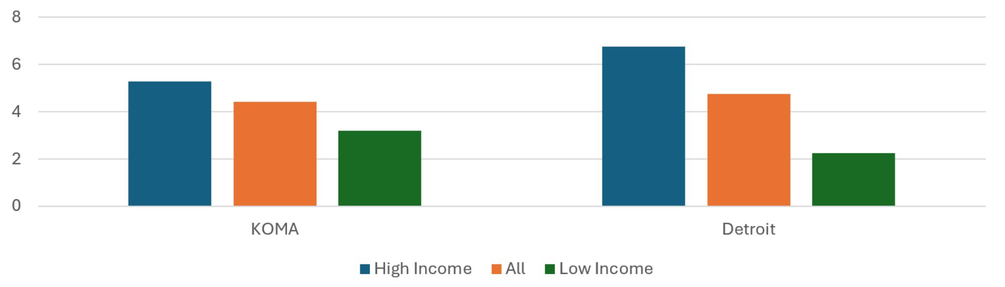
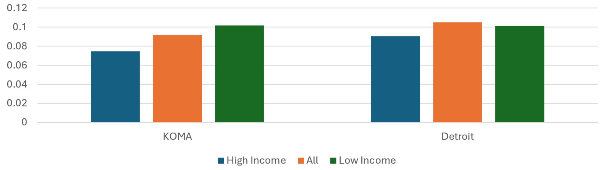
Average Asthma Months to Total Months
Figure 4 separately reports the average share of member months with a diagnosis of asthma for the KOMA and Detroit regions. For each region, the population-weighted average share of asthma months to total months across ZIP codes is presented, along with the weighted averages for ZIP codes in the top income quintile and those in the bottom quintile. As in previous reports, asthma months make up a larger share of total months in KOMA than they do in Detroit. The Detroit region shows the share of asthma months increasing with income quintile, although the absolute differences are small. For KOMA, asthma is more concentrated in the middle of the income distribution than at the extremes. As a result, the percentage gap in asthma months between low and high income quintiles in Detroit is 2.5 times that for KOMA, signaling much greater income disparities in asthma prevalence by income in Detroit than KOMA, even controlling for the underlying differences in their income distributions. While this is of some concern, keep in mind that the prevalences are very small and so even slight absolute differences would constitute large percent differences.
Figure 4: Average Ratio of Asthma Months to Total Months, 2024
Description: The Average Ratio of Asthma Months to Total Months, 2024 graph shows the prevalence of an asthma diagnosis among total member months for the KOMA and Detroit regions when their populations are stratified by mean household income. The regional averages are presented (middle, red) as well as the average from the residents of High Income (left, blue) and Low Income (right, green) ZIP codes. Asthma diagnoses are relatively more prevalent in KOMA. Detroit exhibits slightly greater prevalence of asthma diagnosis in the High Income ZIP codes.
Source: BCBSM, BCN, and Priority Health member data (2025).
Average CAD Months to Total Months
Unlike for asthma, Figure 5 reveals that the share of total months with the presence of a CAD diagnosis is approximately 55 percent greater in Detroit than in the KOMA region. This is up from the 40 percent difference found last year. While CAD prevalence seems concentrated in the middle of the income distribution in Detroit, there is a slight negative relationship between income quintile and CAD prevalence in KOMA. Fortunately, this income disparity is less severe than last year. Low Income ZIP code residents have a prevalence of CAD 18 percent greater than that of High Income ZIP code residents in 2024, a figure that was 31 percent in the previous year. Together with the findings regarding expenditure in the Major Medical Conditions section, Figure 5 suggests that the differences in CAD spending per member could be explained by economies of scale. With roughly three times the population and 55 percent greater prevalence of a CAD diagnosis, the much larger number of CAD patients in the Detroit region could lead to a lower average cost per CAD diagnosis, relative to the KOMA region. The data could also be capturing different diagnosis practices. If providers in the Detroit region make an official diagnosis of CAD at lower levels of severity than do those in KOMA, the expected result would be both a greater prevalence of CAD in Detroit and a lower average severity, and thus expenditure, which would be consistent with the findings of this report.
Figure 5: Average Ratio of CAD Months to Total Months, 2024
Description: The Average Ratio of CAD Months to Total Months, 2024 graph shows the prevalence of a CAD diagnosis among total member months for the KOMA and Detroit regions when their populations are stratified by mean household income. The regional averages are presented (middle, red) as well as the average from the residents of High Income (left, blue) and Low Income (right, green) ZIP codes. CAD diagnoses are relatively more prevalent in the Detroit region. CAD is substantially more prevalent in Detroit than in KOMA, while KOMA exhibits slightly greater prevalence of CAD diagnosis in the Low Income ZIP codes.
Source: BCBSM, BCN, and Priority Health member data (2025).
Average Depression Months to Total Months
Figure 6 shows the distribution of member months with a depression diagnosis, as a share of total member months, across regions and income quintile ZIP codes. Depression member months are 34 percent less common in Detroit than in KOMA, which is consistent with the gap estimated last year. Neither region exhibits an obvious relationship between income and prevalence of depression. Curiously, depression is concentrated in the middle of Detroit’s income distribution while in KOMA it is concentrated at the extremes. Overall, as in previous reports, the most up-to-date evidence shows that the KOMA region exhibits a high relative prevalence of depression, and thus suggests greater exposure to aggravating factors affecting mental health.
Figure 6: Average Ratio of Depression Months to Total Months, 2024
Description: The Average Ratio of Depression Months to Total Months, 2024 graph shows the prevalence of a depression diagnosis among total member months for the KOMA and Detroit regions when their populations are stratified by mean household income. The regional averages are presented (middle, red) as well as the average from the residents of High Income (left, blue) and Low Income (right, green) ZIP codes. Depression diagnoses are relatively more prevalent in KOMA. The two regions do not a strong association between ZIP code income and depression prevalence.
Source: BCBSM, BCN, and Priority Health member data (2025).
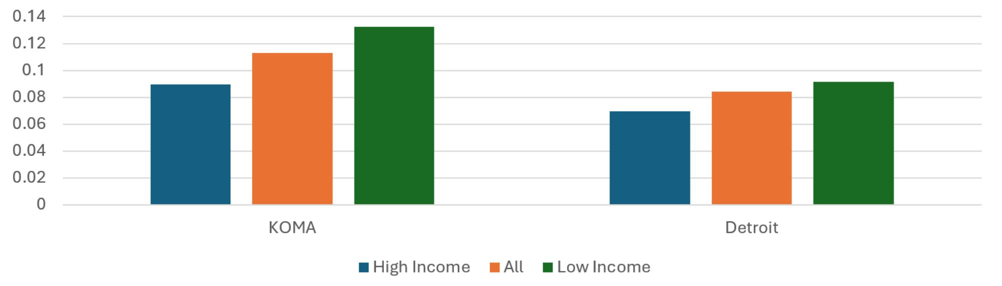
Average Diabetes Months to Total Months
In both the KOMA and Detroit regions, member months with a diabetes diagnosis are most common among the residents of Low Income ZIP codes. This pattern is revealed in Figure 7. Whereas Detroit’s overall prevalence of diabetes was 6 percent greater than KOMA’s in 2023, that gap has shrunk to 3 percent in 2024. The income disparity in diabetes prevalence in KOMA is lower in 2024 than it was in 2023, with the share of member months with a diagnosis of diabetes being 101 percent more common among the Low Income ZIP codes in KOMA, relative to the High Income ZIP codes. It was 136 percent in 2023. The 2024 difference is lower in the Detroit region at 96 percent, which is slightly below its 2023 difference of 105 percent. These income disparities are consistent with findings in the literature showing greater prevalence of diabetes and its associated comorbidities in groups with lower socioeconomic status (Jamil et al. 2008, Clements et al. 2020, Anderson-Carpenter and Neal 2021, Parpia et al. 2021). This represents a welcome downward revision in the income disparity in diabetes prevalence in the KOMA region, compared to that found in previous versions. As the percentage gap in diabetes prevalence in KOMA is greater than Detroit, despite Detroit having a greater income disparity, the income disparity in diabetes prevalence remains greater in KOMA than in Detroit.
Figure 7: Average Ratio of Diabetes Months to Total Months, 2024
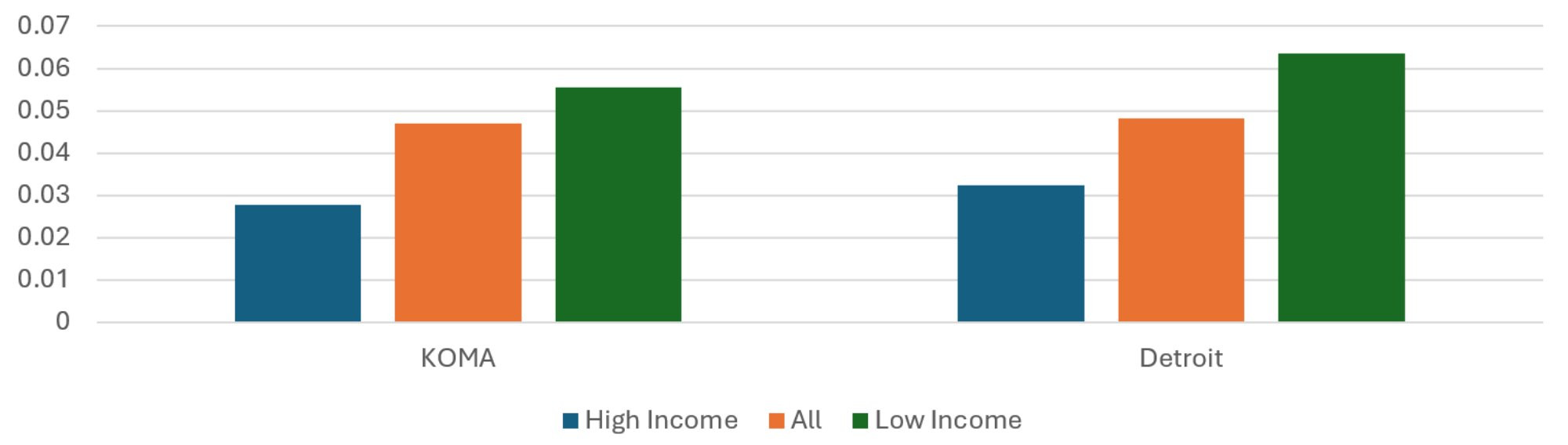
Description: The Average Ratio of Diabetes Months to Total Months, 2024 graph shows the prevalence of a diabetes diagnosis among total member months for the KOMA and Detroit regions when their populations are stratified by mean household income. The regional averages are presented (middle, red) as well as the average from the residents of High Income (left, blue) and Low Income (right, green) ZIP codes. The two regions exhibit similar profiles, with relatively greater prevalence of diabetes diagnosis in the Low Income ZIP codes.
Source: BCBSM, BCN, and Priority Health member data (2025).
Average Hyperlipidemia Months to Total Months
Figure 8 displays the share of total member months with a diagnosis of hyperlipidemia. The average hyperlipidemia share of member months is 15 percent higher in Detroit than in KOMA, which is double the percentage difference observed in 2023. The data reveals a negative association between income quintile and hyperlipidemia prevalence in KOMA. Hyperlipidemia is 36 percent more common among the residents of low income ZIP codes than it is among the residents of High Income ZIP codes. This income disparity in hyperlipidemia prevalence in the KOMA region is lower than the 56 percent difference that was found in last year’s report.
Figure 8: Average Ratio of Hyperlipidemia Months to Total Months, 2024
Description: The Average Ratio of Hyperlipidemia Months to Total Months, 2024 graph shows the prevalence of a hyperlipidemia diagnosis among total member months for the KOMA and Detroit regions when their populations are stratified by mean household income. The regional averages are presented (middle, red) as well as the average from the residents of High Income (left, blue) and Low Income (right, green) ZIP codes. Hyperlipidemia diagnoses are relatively more prevalent in the Detroit region. The two regions exhibit greater prevalence of hyperlipidemia diagnosis in the Low Income ZIP codes, but the difference is more significant in KOMA.
Source: BCBSM, BCN, and Priority Health member data (2025).
Average Low Back Pain Months to Total Months
Differences by region and income quintile in low back pain prevalence can be found in Figure 9. These estimates have shown variability in pattern over the previous two years. Based on 2024 data, low back pain makes up a slightly larger share of total months in KOMA and Detroit regions (1.8 and 1.5 percent, respectively). There is some evidence of an income disparity in low back pain in Detroit, since the Low Income ZIP residents have a prevalence 41 percent greater than do the High Income residents. The absolute prevalences are small, however, and so this result could be due to noise.
Figure 9: Average Ratio of Lower Back Pain Months to Total Months, 2024
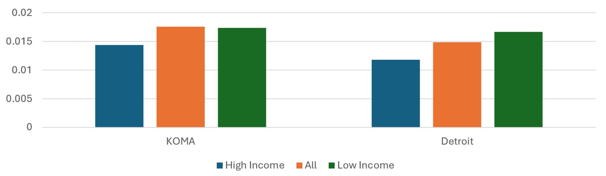
Description: The Average Ratio of Low Back Pain Months to Total Months, 2024 graph shows the prevalence of a low back pain diagnosis among total member months for the KOMA and Detroit regions when their populations are stratified by mean household income. The regional averages are presented (middle, red) as well as the average from the residents of High Income (left, blue) and Low Income (right, green) ZIP codes. Low back pain diagnoses are relatively more prevalent in the KOMA region. The two regions exhibit greater prevalence of low back pain diagnosis in the Low Income ZIP codes, but the difference is more significant in the Detroit region.
Source: BCBSM, BCN, and Priority Health member data (2025).
Disparities by Race
Table 2 shows descriptive statistics where ZIP codes in the two regions are categorized by race. As was true in Table 1, the KOMA region has a lower weighted mean household income and smaller Black share of the population than is found in the Detroit region. When isolating the sets of ZIP codes in each region that make up 20 percent of the regional population and have the highest white share of the ZIP code population, which are labeled “High Share White” ZIP codes, we see that the two regions have a similar racial distribution (roughly 95 to 97 percent white and 1.5 to 3 percent Black). On the other hand, the sets of ZIP codes meeting the 20 percent regional population threshold having the highest Black share of the population (“High Share Black” ZIP codes) are quite different across regions. Even the High Share Black ZIP codes in the KOMA region tend to be majority white, having a weighted average Black share of the population equal to approximately 26 percent. The same is not true in the Detroit region, where the same classification of ZIP code has an average Black share of the population equal to roughly 81 percent. Therefore, a key difference between High Share Black ZIP codes across regions is the degree of racial segregation. Descriptions in the literature note the significance of racial segregation in determining a variety of health outcomes (Mechanic 2005, Grady and Darden 2012, Mein 2020, Gu et al. 2020, Parpia et al. 2021). Therefore, while patterns in outcome variables across quintiles in the KOMA region may illustrate different health outcomes varying with racial concentrations, the patterns in the Detroit region may reveal the additional impact of racial segregation.
Table 2
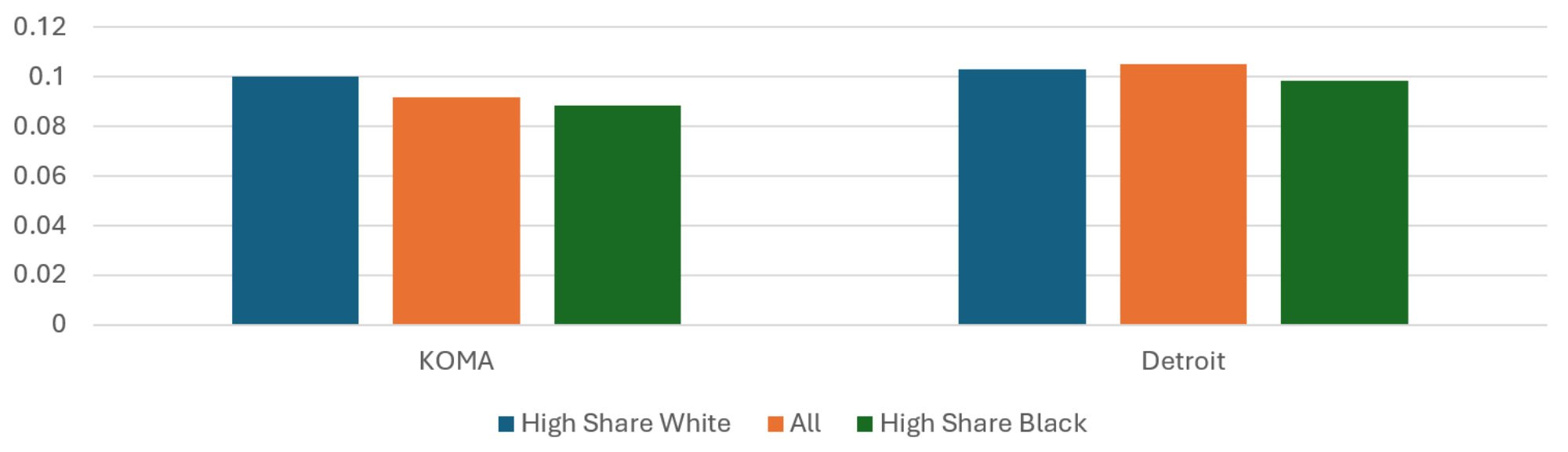
Average Risk Score
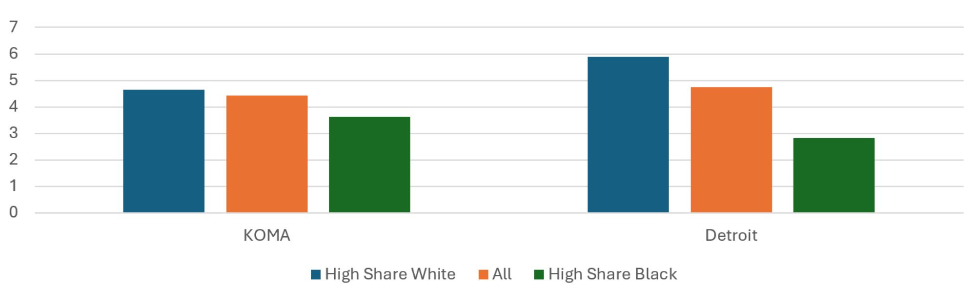
The population-weighted average risk scores across regions and quintiles are presented in Figure 10. While the average risk score is 13 percent higher in the Detroit region than in KOMA, the two do not exhibit the same relationship between risk score and racial shares of the population. In the KOMA region, the average risk score of the High Share Black ZIP codes is about the same as that of the High Share White ZIP codes for 2024. This is not true in the Detroit region, where the High Share Black ZIP codes have an average risk score 17 percent higher than the High Share White ZIP codes, which is roughly the same as in previous years. The Detroit pattern of racial disparity in risk score is not far off of the income disparity in risk score, so it is not clear whether race or income is most responsible for the risk score differences. For KOMA, on the other hand, the disparity observed when stratifying by income is not observed when stratifying by race.
Figure 10: Average Risk Score, 2024
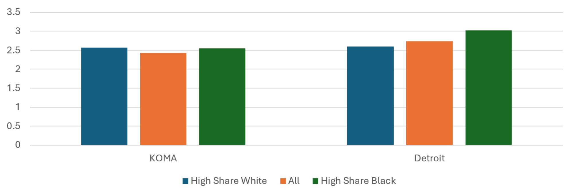
Description: The Average Risk Score, 2024 graph shows the average risk scores for the KOMA and Detroit regions when their populations are stratified by race. The regional averages are presented (middle, red) as well as the average from the residents of High Share White (left, blue) and High Share Black (right, green) ZIP codes. The two regions exhibit different profiles, with slightly more negative health risk factors and characteristics (high risk scores) in the High Share White ZIP codes of KOMA. The opposite is true for the Detroit region.
Source: BCBSM, BCN, and Priority Health member data (2025).
Average Insured Months per Resident
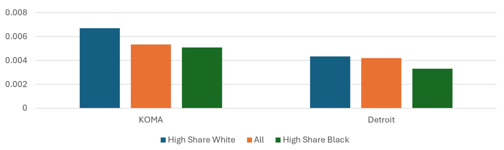
The racial disparities in average member months per resident displayed in Figure 11 closely resemble the income disparities found in Figure 2. The residents of KOMA’s High Share Black ZIP codes have 22 percent fewer insured months per capita than residents of its High Share White ZIP codes. This figure is 52 percent for Detroit, but it is important to remember that the underlying disparities in race across sets of ZIP codes is much greater in Detroit. The share of Black residents in KOMA’s High Share Black ZIP codes is 16 times greater than that of its High Share White ZIP codes. For Detroit, it is 27 times greater. Therefore, even though Detroit has double the percent difference in insured months per capita between quintiles, it also has nearly double the disparity in the Black share of the population. For this reason, the racial disparities in the two regions in insured months are fairly comparable. Once again, given the relatively low apparent rate of private insurance in the High Share Black ZIP codes in the two regions, there is a greater likelihood that the privately insured population of these ZIP codes is not representative of the ZIP code population. Notably, as private health insurance is associated with better employment and socioeconomic status, this implies that these figures may underrepresent the disparities in outcomes between High Share White and High Share Black ZIP codes.
Figure 11: Average Insured Months per Resident, 2024
Description: The Average Insured Months per Resident, 20243 graph shows the total insured member months divided by population for the KOMA and Detroit regions when their populations are stratified by race. The regional averages are presented (middle, red) as well as the average from the residents of High Share White (left, blue) and High Share Black (right, green) ZIP codes. The two regions exhibit similar profiles, with relatively more insured months per resident of the High Share White ZIP codes, but the difference between High and Low Income ZIP codes is greater in Detroit than in KOMA.
Source: BCBSM, BCN, and Priority Health member data (2025).
Average Healthy Months to Total Months
Figure 12 displays differences across regions and racial shares in the ratio of healthy member months to total member months. In 2024, the residents of High Share Black ZIP codes in the KOMA region have a 7.5 percent greater share of healthy months than do the residents of the region’s High Share White ZIP codes, which is substantially difference than the previous year’s finding of essentially no difference. This is despite the High Share Black ZIP codes having a lower weighted mean household income than the High Share White ZIP codes, which led to the notable income disparity in healthy month prevalence shown in Figure 3. In Detroit, on the other hand, the residents of High Share Black ZIP codes have a nine percent higher share of healthy months than do the residents of the High Share White ZIP codes. This is down from last year difference of 12 percent. The shrinking racial disparities in healthy months in both regions, particularly in KOMA, is a welcome result.
Figure 12: Average Ratio of Healthy Months to Total Months, 2024
Description: The Average Ratio of Healthy Months to Total Months, 2024 graph shows the number of healthy member months divided by total months for the KOMA and Detroit regions when their populations are stratified by race. The regional averages are presented (middle, red) as well as the average from the residents of High Share White (left, blue) and High Share Black (right, green) ZIP codes. The two regions exhibit similar profiles, with a relatively greater prevalence of healthy months among the residents in the High Share Black ZIP codes.
Source: BCBSM, BCN, and Priority Health member data (2025).
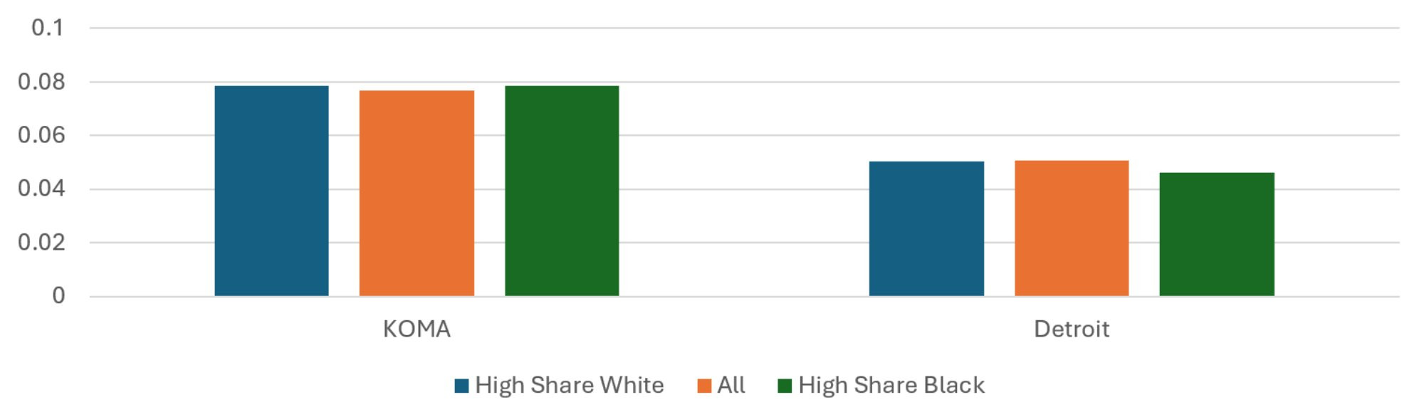
Average Asthma Months to Total Months
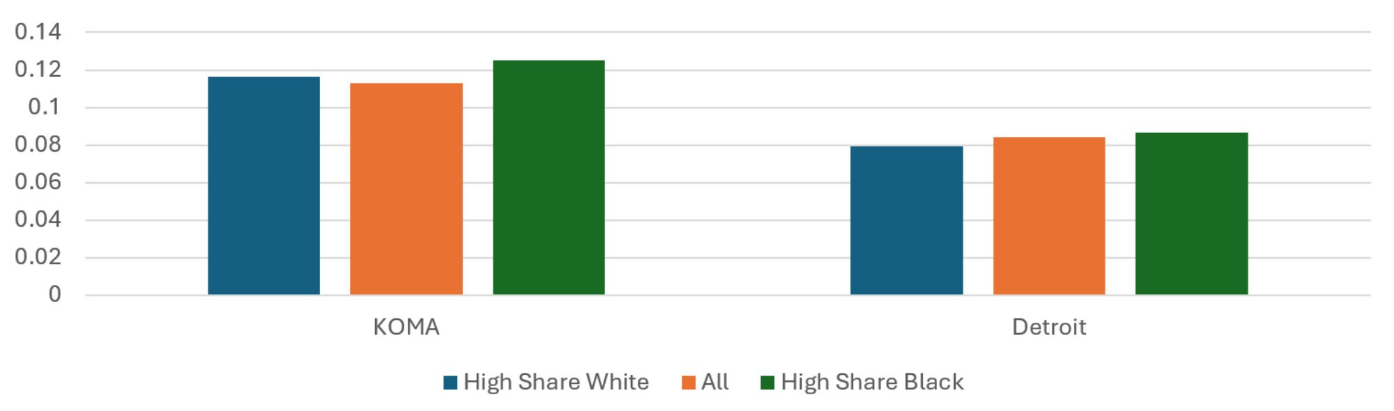
Patterns in the share of member months with an asthma diagnosis across racially defined quintiles are shown in Figure 13. The residents of High Share Black ZIP codes in the KOMA region have a 24 percent lower share of asthma months than do the residents of the region’s High Share White ZIP codes in 2024, which is markedly different from last year. In 2023, asthma prevalence in KOMA’s High Share Black ZIP codes was 18 percent greater. This is the result of a 0.17 percentage point (34 percent) increase in asthma prevalence among KOMA’s High Share White ZIP codes between 2023 and 2024. The prevalence in KOMA generally is roughly unchanged and has declined by 14 percent in its High Share Black ZIP codes. The same association is found in Detroit and is not much changed from the previous year. There, the residents of High Share Black ZIP codes have a 24 percent lower share of asthma months than do the residents of the High Share White ZIP codes. This is a decrease for Detroit, compared to last year’s 26 percent difference.
Figure 13: Average Ratio of Asthma Months to Total Months, 2024
Description: The Average Ratio of Asthma Months to Total Months, 2024 graph shows the prevalence of an asthma diagnosis among total member months for the KOMA and Detroit regions when their populations are stratified by race. The regional averages are presented (middle, red) as well as the average from the residents of High Share White (left, blue) and High Share Black (right, green) ZIP codes. Asthma is more prevalent in KOMA. The two regions exhibit similar profiles, with a relatively greater prevalence of asthma diagnosis among the residents of the High Share White ZIP codes.
Source: BCBSM, BCN, and Priority Health member data (2025).
Average CAD Months to Total Months
The patterns regarding regional and racial disparities in CAD can be found in Figure 14 and are somewhat different from those regarding income disparities found in Figure 5. CAD prevalence is slightly down in KOMA and essentially unchanged in Detroit in 2024, compared to 2023. Prevalence of CAD among the High Share White residents of KOMA is down 34 percent compared to the previous year, which has eliminated the racial disparity in CAD prevalence in KOMA that existed last year favoring the High Share Black ZIP codes. The prevalences in Detroit are 4 percent greater than those from last year.
Figure 14: Average Ratio of CAD Months to Total Months, 2024
Description: The Average Ratio of CAD Months to Total Months, 2024 graph shows the prevalence of a CAD diagnosis among total member months for the KOMA and Detroit regions when their populations are stratified by race. The regional averages are presented (middle, red) as well as the average from the residents of High Share White (left, blue) and High Share Black (right, green) ZIP codes. CAD is more prevalent in Detroit. Detroit has a relatively greater prevalence of CAD diagnosis among the residents of the High Share White ZIP codes.
Source: BCBSM, BCN, and Priority Health member data (2025).
Average Depression Months to Total Months
Figure 15 from last year’s report showed a substantial racial disparity in depression prevalence in KOMA that favored its High Share White ZIP codes. This is not observed this year in the 2024 data. This is due to a 1.9 percentage point (32 percent) increase in depression prevalence in the region’s High Share White ZIP codes, while that of the High Share Black ZIP codes increased very slightly. Detroit’s prevalences of depression have only changed slightly from last year. As a result, its High Share Black ZIP code residents have an 8 percent lower share of depression months than do the residents of the region’s High Share White ZIP codes. This is down from 12 percent last year. Together with the results for asthma, the results for depression show sizeable jumps in prevalence of two chronic conditions in KOMA that seem localized to the High Share White ZIP codes.
Figure 15: Average Ratio of Depression Months to Total Months, 2024
Description: The Average Ratio of Depression Months to Total Months, 2024 graph shows the prevalence of a depression diagnosis among total member months for the KOMA and Detroit regions when their populations are stratified by race. The regional averages are presented (middle, red) as well as the average from the residents of High Share White (left, blue) and High Share Black (right, green) ZIP codes. Depression is more prevalent in KOMA. Detroit exhibits a slightly greater prevalence of CAD diagnosis among the residents of the High Share White ZIP codes.
Source: BCBSM, BCN, and Priority Health member data (2025).
Average Diabetes Months to Total Months
As Figure 7 shows, the two regions exhibit the same disparities in diabetes prevalence when stratifying by income. When stratifying by race, as in Figure 16, the two regions show two different racial disparities. In Detroit, the High Share Black ZIP codes have a 73 percent greater prevalence of diabetes than the High Share White ZIP codes. On the other hand, In KOMA, the High Share Black ZIP codes have a 26 percent lower prevalence of diabetes than the High Share White ZIP codes. While this is not much of a change in the Detroit region, it is a reversal of the percentage gap observed in KOMA last year, where the High Share Black ZIP codes had a 5 percent greater prevalence of diabetes than the High Share White ZIP codes. Once again, the abrupt change in racial disparity in diabetes observed in KOMA between 2023 and 2024 is due to a sizable increase in prevalence among its High Share White ZIP codes. For these ZIP codes, diabetes prevalence grew by 2.8 percentage points (70 percent). This is a troubling trend in the prevalence of chronic conditions for the High Share White ZIP codes.
Figure 16: Average Ratio of Diabetes Months to Total Months, 2024
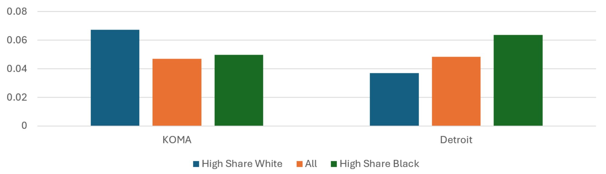
Description: The Average Ratio of Diabetes Months to Total Months, 2024 graph shows the prevalence of a diabetes diagnosis among total member months for the KOMA and Detroit regions when their populations are stratified by race. The regional averages are presented (middle, red) as well as the average from the residents of High Share White (left, blue) and High Share Black (right, green) ZIP codes. Diabetes is slightly more prevalent in Detroit. The two regions exhibit differnt profiles, with a relatively greater prevalence of diabetes diagnosis among the Detroit residents of the High Share Black ZIP codes. The opposite is true in KOMA.
Source: BCBSM, BCN, and Priority Health member data (2025).
Average Hyperlipidemia Months to Total Months
Figure 17 reveals the racial disparities in hyperlipidemia prevalence in the two regions. These have not changed much from the previous year, although there is some reduction in racial disparity for KOMA. In 2023, KOMA’s High Share Black ZIP codes had a 17 percent lower prevalence of hyperlipidemia than its High Share White ZIP codes. This disparity is down to 12 percent in 2024. Hyperlipidemia prevalence has increased in Detroit, although all racial quintiles seem to have been affected equally. As a result, KOMA still has the greater racial disparity in the prevalence of hyperlipidemia than Detroit, though the gap decreased between 2023 and 2034.
Figure 17: Average Ratio of Hyperlipidemia Months to Total Months, 2024
Description: The Average Ratio of Hyperlipidemia Months to Total Months, 2024 graph shows the prevalence of a hyperlipidemia diagnosis among total member months for the KOMA and Detroit regions when their populations are stratified by race. The regional averages are presented (middle, red) as well as the average from the residents of High Share White (left, blue) and High Share Black (right, green) ZIP codes. Hyperlipidemia is more prevalent in Detroit. The two regions exhibit similar profiles, with a slightly greater prevalence of hyperlipidemia diagnosis among the residents of the High Share White ZIP codes. The difference is more pronounced in KOMA.
Source: BCBSM, BCN, and Priority Health member data (2025).
Average Low Back Pain Months to Total Months
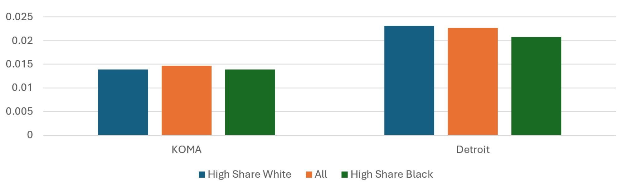
Finally, Figure 18 reveals the shares of total member months with a diagnosis of low back pain in the two regions, while also separating out the sets of ZIP codes each with high shares of white and Black residents. Separating by race in Figure 18 shows negligible racial disparities in 2024 for both KOMA and Detroit. This was not the case in 2023. For that year, in KOMA, low back pain was 22 percent more prevalent among High Share Black ZIP codes than among High Share White ZIP codes. This figure was 11 percent for Detroit. These two percentage gaps have declined to 0.5 and 9 percent, respectively. The reduced racial disparity in KOMA is once again the result of sizeable increases (0.3 percentage points or 21 percent) in prevalence among its High Share White ZIP code populations. This is a troubling trend in the prevalence of chronic conditions in the KOMA region.
Figure 18: Average Ratio of Low Back Pain Months to Total Months, 2024
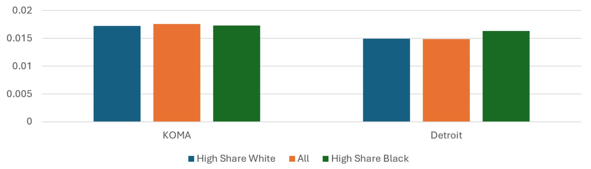
Description: The Average Ratio of Low Back Pain Months to Total Months, 2024 graph shows the prevalence of a low back pain diagnosis among total member months for the KOMA and Detroit regions when their populations are stratified by race. The regional averages are presented (middle, red) as well as the average from the residents of High Share White (left, blue) and High Share Black (right, green) ZIP codes. The two regions exhibit similar profiles, with a relatively greater prevalence of low back pain diagnosis among the residents of the High Share Black ZIP codes. The difference is more pronounced in Detroit.
Source: BCBSM, BCN, and Priority Health member data (2025).
Summary
The goal of this section is to investigate disparities in health outcomes between the Detroit and KOMA regions according to income or race. It does this using payer data from PH, BCBSM, and BCN regarding member diagnoses and risk scores reported at the ZIP code level. To categorize members according to income and race, we use 2020 census data at the ZIP code level to identify the ZIP codes in each region that both a) have the highest (lowest) mean household incomes and highest white (Black) share of ZIP code residents and b) hold a combined 20 percent of the regional population. To the extent that the characteristics of the privately insured membership from these ZIP codes are correlated with the characteristics of the ZIP code residents, this approach allows us to examine for differences in health outcomes correlated with race or income.
On the whole, when examining disparities due to income, we find patterns that are similar in the two regions. Relative to High Income ZIP codes, Low Income ZIP codes in the two regions tend to have higher average risk scores and fewer privately insured months per resident. Additionally, Low Income ZIP codes exhibit a relatively low share of months with an asthma diagnosis. The opposite was true for months with a diabetes diagnosis, which was more common among Low Income ZIP codes in the two regions. The exceptions to these common patterns were for CAD and hyperlipidemia, where there were small income disparities for KOMA but not for Detroit. This is not a radical departure from previous reports, but the presence of income disparities specific to the KOMA region remains a concern.
Differences in pattern are more apparent when investigating disparities in outcomes due to race, though racial disparities tended to decline for both regions in 2024, compared to 2023. The differences in pattern are consistent with the literature, where poorer health outcomes for Black residents have been noted in Michigan and the Detroit area concerning cancer (Meliker et al. 2009), hepatitis C (Bourgi et al. 2016), tuberculosis (Noppert et al. 2017), and COVID-19 (Mein 2020, Gu et al. 2020, Anderson-Carpenter and Neal 2021, Parpia et al. 2021). In this study, we find that the average risk score was higher for High Share Black ZIP codes than for High Share White ZIP codes in Detroit, while this was not the case in KOMA. Asthma was a less common diagnosis among member months for High Share Black ZIP codes than for High Share White ZIP codes in KOMA, a reversal from the previous year. The same disparity was observed for Detroit, though it was smaller in magnitude. Compared to previous reports, the different racial disparities usually observed in CAD and low back pain were much more muted in both regions in 2024. An exception was diabetes, where the opposite racial disparity is observed in the two regions. There were sizeable percent increases in the prevalence of several conditions (asthma, depression, diabetes, and low back pain) among the High Share White ZIP codes of KOMA, compared to small or no changes in Detroit. Both regions showed some general reductions in racial disparities in the prevalence of chronic conditions, which is encouraging. For KOMA, it tended not to be due to improving conditions among the High Share Black ZIP codes, however, but from worsening conditions among the High Share White ZIP codes, which is a troubling development.
References
Anderson-Carpenter, Kaston D., and Zachary P. Neal. “Racial disparities in COVID-19 impacts in Michigan, USA.” Journal of Racial and Ethnic Health Disparities (2021): 1-9.
Bourgi, Kassem, Indira Brar, and Kimberly Baker-Genaw. “Health disparities in hepatitis C screening and linkage to care at an integrated health system in southeast Michigan.” PLoS One 11, no. 8 (2016): e0161241.
Clements, John M., Mariana Rosca, Carla Cavallin, Shelby Falkenhagen, Thomas Ittoop, Christina K. Jung, Megan Mazzella, Joseph A. Reed, Megan Schluentz, and Caleb VanDyke. “Type 2 diabetes and chronic conditions disparities in Medicare beneficiaries in the State of Michigan.” The American journal of the medical sciences 359, no. 4 (2020): 218-225.
Grady, Sue, and Joe Darden. “Spatial methods to study local racial residential segregation and infant health in Detroit, Michigan.” Annals of the Association of American Geographers 102, no. 5 (2012): 922-931.
Gu, Tian, Jasmine A. Mack, Maxwell Salvatore, Swaraaj Prabhu Sankar, Thomas S. Valley, Karandeep Singh, Brahmajee
K. Nallamothu et al. “COVID-19 outcomes, risk factors and associations by race: a comprehensive analysis using electronic health records data in Michigan Medicine.” MedRxiv (2020).
Iguchi, Martin Y., James Bell, Rajeev N. Ramchand, and Terry Fain. “How criminal system racial disparities may translate into health disparities.” Journal of health care for the poor and underserved.” 16, no. 4 (2005): 48-56.
Jamil, Hikmet, Monty Fakhouri, Florence Dallo, Thomas Templin,
Radwan Khoury, and Haifa Fakhouri. “Disparities in self-reported diabetes mellitus among Arab, Chaldean,
and Black Americans in Southeast Michigan.” Journal of immigrant and minority health 10, no. 5 (2008): 397-405.
Mechanic, David. “Policy challenges in addressing racial disparities and improving population health.” Health Affairs 24, no. 2 (2005): 335-338.
Mein, Stephen A. “COVID-19 and health disparities: the reality of “the Great Equalizer”.” Journal of General Internal Medicine 35, no. 8 (2020): 2439.
Meliker, Jaymie R., Pierre Goovaerts, Geoffrey M. Jacquez, Gillian A. AvRuskin, and Glenn Copeland. “Breast and prostate cancer survival in Michigan: can geographic analyses assist in understanding racial disparities?.” Cancer 115, no. 10 (2009): 2212-2221.
Noppert, Grace A., Mark L. Wilson, Philippa Clarke, Wen Ye, Peter Davidson, and Zhenhua Yang. “Race and nativity are major determinants of tuberculosis in the US: evidence of health disparities in tuberculosis incidence in Michigan, 2004–2012.” BMC public health 17, no. 1 (2017): 1-11.
Parpia, Alyssa S., Isabel Martinez, Abdulrahman M. El- Sayed, Chad R. Wells, Lindsey Myers, Jeffrey Duncan, Jim Collins, Meagan C. Fitzpatrick, Alison P.Galvani, and Abhishek Pandey. “Racial disparities in COVID-19 mortality across Michigan, United States.” EClinical Medicine 33 (2021): 100761.
U.S. Census Bureau. (2020). 2020 American Community Survey 5-year Estimates Subject Tables, [Table S1902]. Retrieved from https://www.census.gov/data.html.
U.S. Census Bureau. (2020). 2020 Decennial Census Demographic and Housing and Characteristics File, [DHC]. Retrieved from https://www.census.gov/data.html.

Daniel Montanera, Ph.D., Associate Professor, Department of Economics