Revelation of the Complex with a Little Help from Multidisciplinary Teams
“The commonality between science and art is in trying to see profoundly - to develop strategies of seeing and showing. The world is much more interesting than any one discipline. What is to be sought in designs for the display of information is the clear portrayal of complexity. Not the complication of the simple; rather the task of the designer is to give visual access to the subtle and the difficultꟷthat is, revelation of the complex. ”
Edward Tufte
About six years ago, then Associate Dean Gretchen Galbraith introduced Bradford Dykes (Statistics) and Tammy Shreiner (History) as part of the digital humanities conversations going on within the college. The rest is history—oh, and statistics.
Tammy and Bradford discovered that they had many mutual interests in data visualization and data literacy for K-12 social studies and history instruction—and how to help teachers to teach them. Their work meshed so well that in 2018, they applied for and received a collaborative grant from CSCE to do a project on how teachers perceive the role of data literacy in social studies and how they teach it.
“We were on a roll and projects emerged out of those we were working on,” Bradford explains.
Creating educational resources was to be their next step.
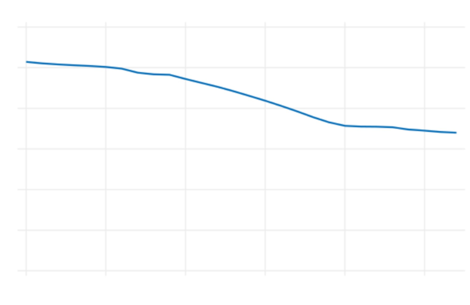
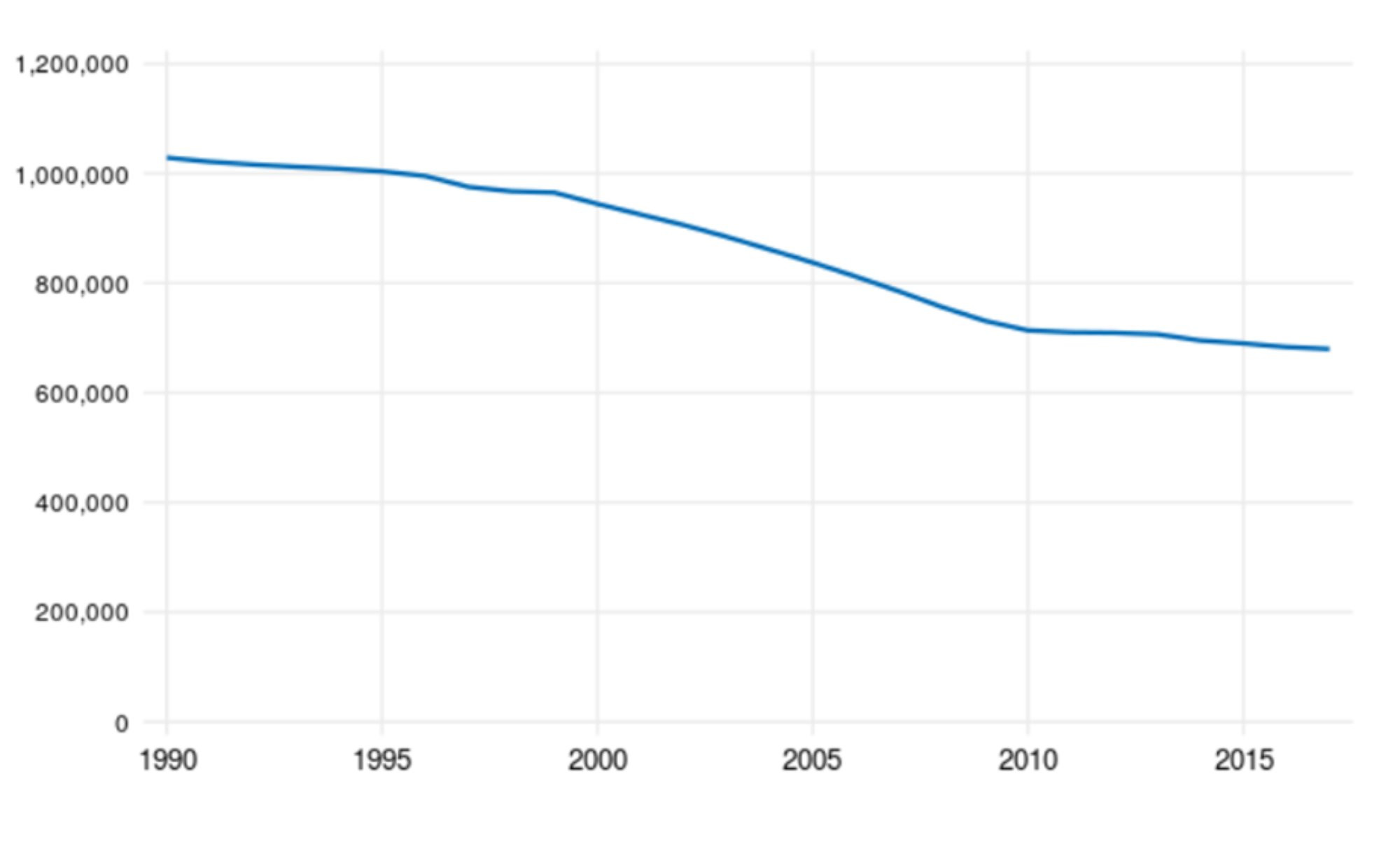
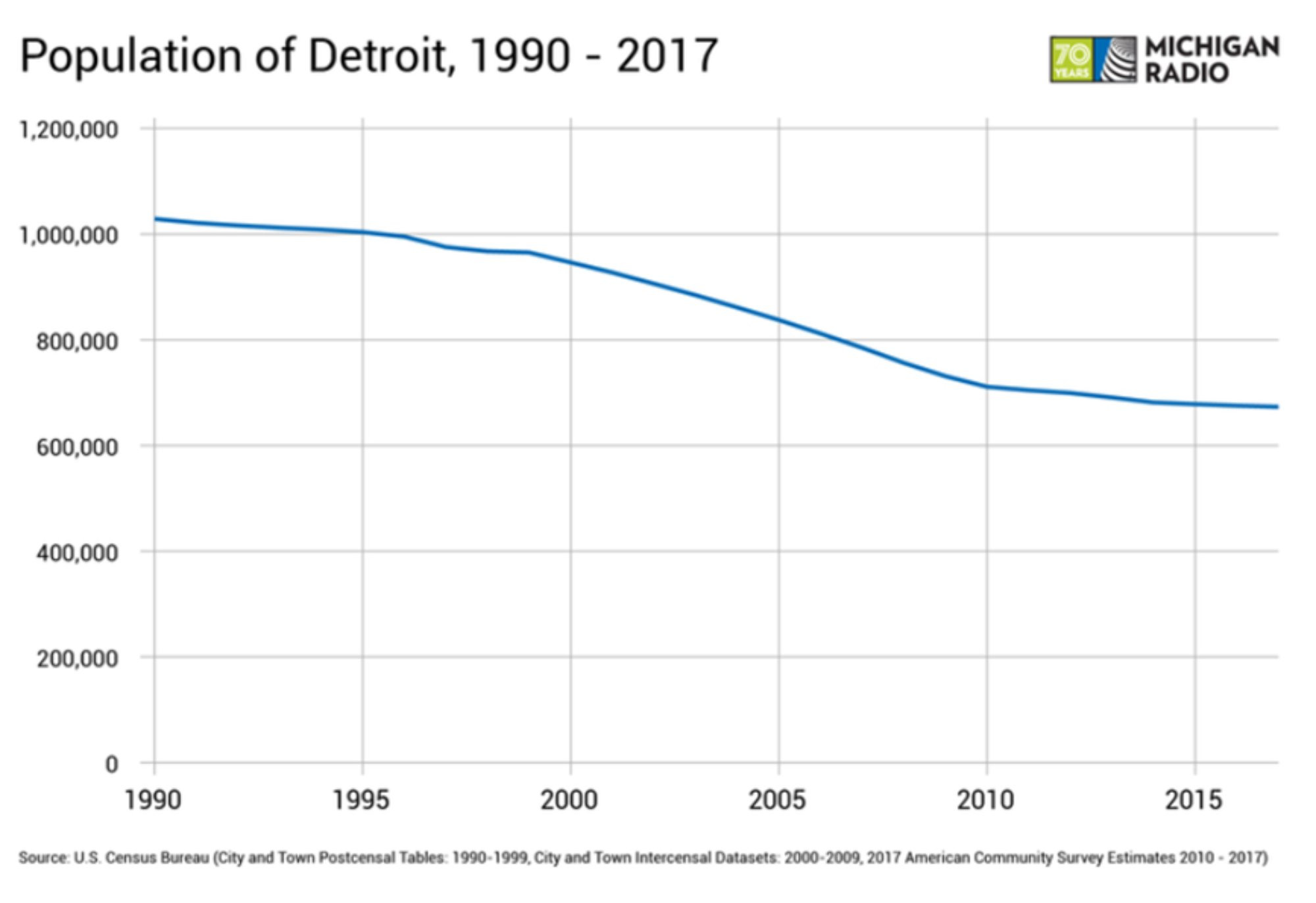
One of these projects has been particularly fruitful. Slow reveal graphs, as one website puts it, are about sense-making. Imagine a teaching method for data visualization which begins with a graph that is masked except for its most basic geometries—one line against unlabeled axes. Gradually, numbers appear along the axes without additional labels, then one element at a time, the graph is revealed in its full complexity.


Samples from a slow reveal graph
“With each element, students can talk about what they see and conjecture about it. They can focus on the visual elements of the graph and wonder about it,” Tammy describes. “We started meeting weekly to discuss the benefits of the slow reveal graphs and what they reveal to students about their subjects—but we had to acknowledge that they are hard to create. Rudimentary ones can be created in PowerPoint, but Bradford knew that using the R program[i], we could create more sophisticated ones.”
While Bradford knew how to work in R, he and Tammy decided that they could take their collaboration to the next level by recruiting two students to collaborate with them and with each other. Enter Statistics/English major Ellie Zimmerman and Group Social Studies/Elementary Education major Amanda Wilder.
Amanda applied for the summer research opportunity after taking Tammy’s class. Amanda says, “I took Professor Shreiner’s class on becoming a data-literate social studies teacher. I wanted to expand my knowledge of research—learn how to do it, how to come up with what to research. This has been good for improving my math skills and ability to graph, and allowed me to wear both my student and teacher hats.”
Amanda has enjoyed coming up with compelling questions to ask as each stage of the graph is revealed. She describes this as thinking about what the students need to understand before, during and after the lesson being taught. “It is also interesting to develop your relationship and work one-on-one with a professor while also working in another discipline with Ellie. Sometimes it comes down to 'can you do this? I can’t'.”
Ellie introduces herself as “the stats student” but is quick to add that she is an English double major. “I applied because I had been working in the GVSU Knowledge Market as a research assistant and learned that a position had opened up. It was the perfect opportunity to learn to research and see what that entails.”
“I got a lot out of it—I brushed up on history, it was really interesting to look at the primary graphs I was re-creating because that told me a lot about how stats and data visualization have evolved over time.”
Ellie was working with images of hand-drawn graphs from the early 1900s, sometimes even hunting down fonts that were a reasonable facsimile of the original maker’s hand lettering.
“This has really developed my R skills which is valuable to any work I’ll be doing. It’s a great language,” Ellie notes. “Collaborating with Amanda is great—she finds visualizations I might not have thought of and then I find one and we see if both can fit in.”
“A better one!” Amanda offers humbly.
“Not always!” Ellie insists. “Amanda knows the ed side, and I know which graphs are most comparable—humanities and stats mixed together!”
A picture may well be worth a thousand words, so the team happily displays what they have been working on:
Bradford says that this collaboration has also expanded his perspective on research methods. “We are finding the story behind the story.”
Tammy suggests the type of questions that the slow reveal graphs facilitate: What do you wonder? What information do you need? What are we missing (the graph title, the labels of axes, why the changes may have occurred, the reliability of the source)? These lay the groundwork for a lesson on challenging topics such as redlining, the ramifications of a station closure, and the reliance on the auto industry.
“Slow reveal graphs help with inquiry as well as developing graph skills. They make it easier to bring context into the graphs,” Tammy says.
The budding educator very much in evidence, Amanda explains that she had an interest in redlining and that the research allowed her to take that further. “The red line inscribed Black and Hispanic populations and they were unable to have mobility into the suburbs. The actions of real estate agents, the lack of loans, in the deeds of houses even, the characterization of a neighborhood as dangerous—the slow reveal makes looking at these less intimidating.
Tammy adds that this pedagogy allows teachers to get around misconceptions.
Ellie suggests jumping into the eugenics graph. This one was created in R due to its complexity. She explains that Harry Laughlin, the creator of the original, used his graph to give testimony. His slim hand-drawn lines made it challenging to reproduce. That made Ellie wonder about good and bad graphs both as visualizations and when individual countries were compared to regions in order to manipulate data. “That would no longer be acceptable,” Ellie states.
Tammy takes this opportunity to look at another aspect of bad graphs. “Statistics and history come together in social studies. Laughlin was trying to stop some ‘undesirable’ groups from immigrating and was manipulating the data. The methodology was really suspect. ‘Undesirability’ was calculated in terms of a group’s representation in asylums and such. With Ellie’s help applying the masks to the graph, it is easier to show students what Laughlin was up to, how the manipulations were accomplished.”
Acknowledging that eugenicists were behind some of the early work in statistics, Bradford is glad that their work can help contemporary students to be more aware of data manipulation.
Ellie notes that despite the 2-1/2 weeks it took her to represent it, that the Tulsa Race Massacre graph was the most rewarding of all. “This one was done for Professor Shreiner. I learned about this on the internet, not from my schooling. She presented our work to teachers in Missouri at a conference, and we hope to publish it soon.”
She also sees her technical progress, now comfortable with R and ggplot when before she had only experienced SAS and Java. She clearly enjoys that Professor Dykes can answer her questions about terminology so that she can search for answers online with more precision.
While this collaboration was designed as a summer project, more funding is being sought so that Amanda can keep working. She has her sights on a PhD so knows this work will help her prepare.
Meanwhile, Tammy and Bradford have received funding for a graduate assistant.
Tammy sees that students who have had her course on data visualization can only dig into instructional techniques so far within the confines of a single course. “I see how much more they learn in a project like this. I want to see more opportunities like this.”
__________________________
[i] R is a programming language and free software environment for statistical computing and graphics supported by the R Core Team and the R Foundation for Statistical Computing. The R language is widely used among statisticians and data miners for developing statistical software and data analysis. (Wikipedia)


